
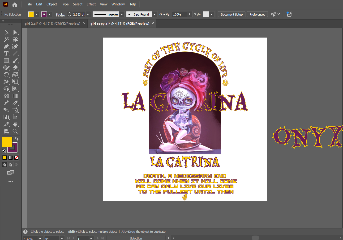
Design Process
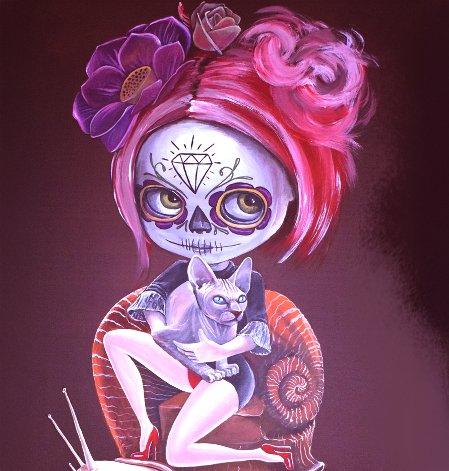
LA CATRINA
Mar

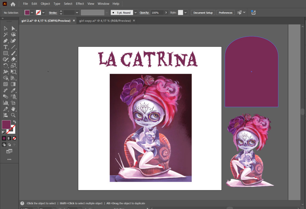
Step 1: Preparing the Artwork in Illustrator
The process begins in Illustrator, where most of the work will take place, including adding text. The main idea is to create text that extends outward from behind the artwork and modify its geometry to add a unique visual effect.
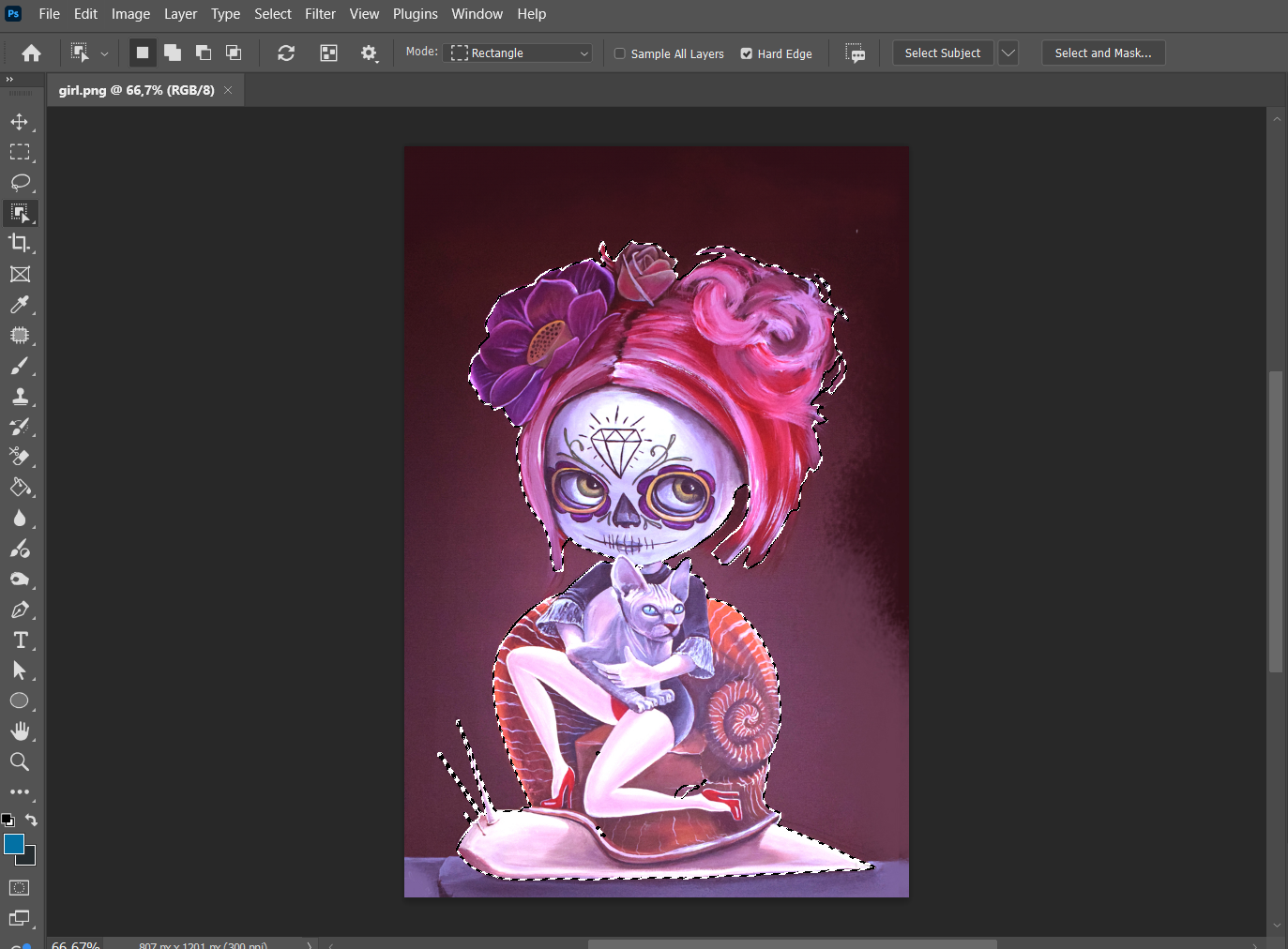
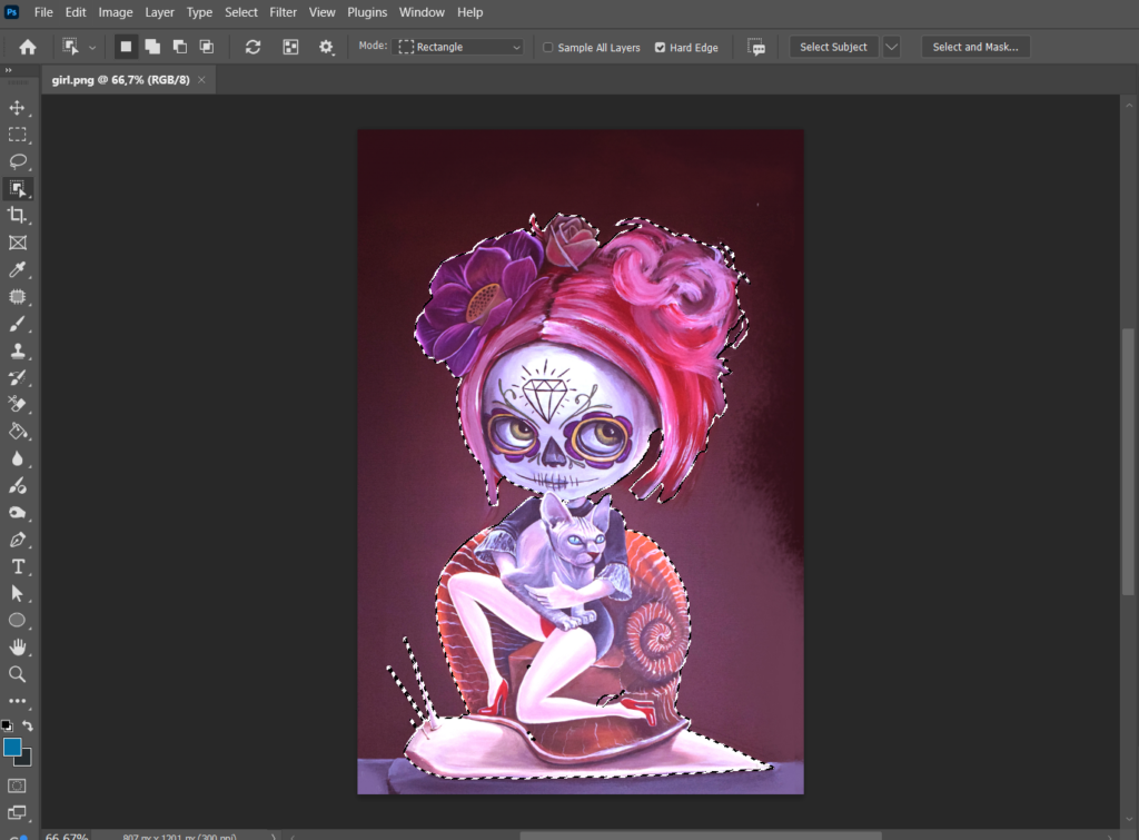
Step 2: Preparing the Image in Photoshop
To integrate the text between layers, the artwork is first imported into Photoshop. The main object— in this case, the female figure— is cut out. The cutout doesn’t need to be perfect since the full artwork will be layered on top. The purpose is simply to create space for the text between the two layers.
Step 3: Working with Text in Illustrator
Once the cutout is done, the file is transferred back to Illustrator. Here, the text is added in a style that complements the artwork, and distortions or geometric modifications are applied to enhance the composition. Additionally, skull elements were incorporated, sourced from another artist through proper licensing.
Step 4: Merging Elements and Adding Color
After adding all the elements, they were merged into a balanced composition. The color palette was developed intuitively— we initially started with a yellow tone, and as the process flowed naturally, we continued refining it to match the overall concept.
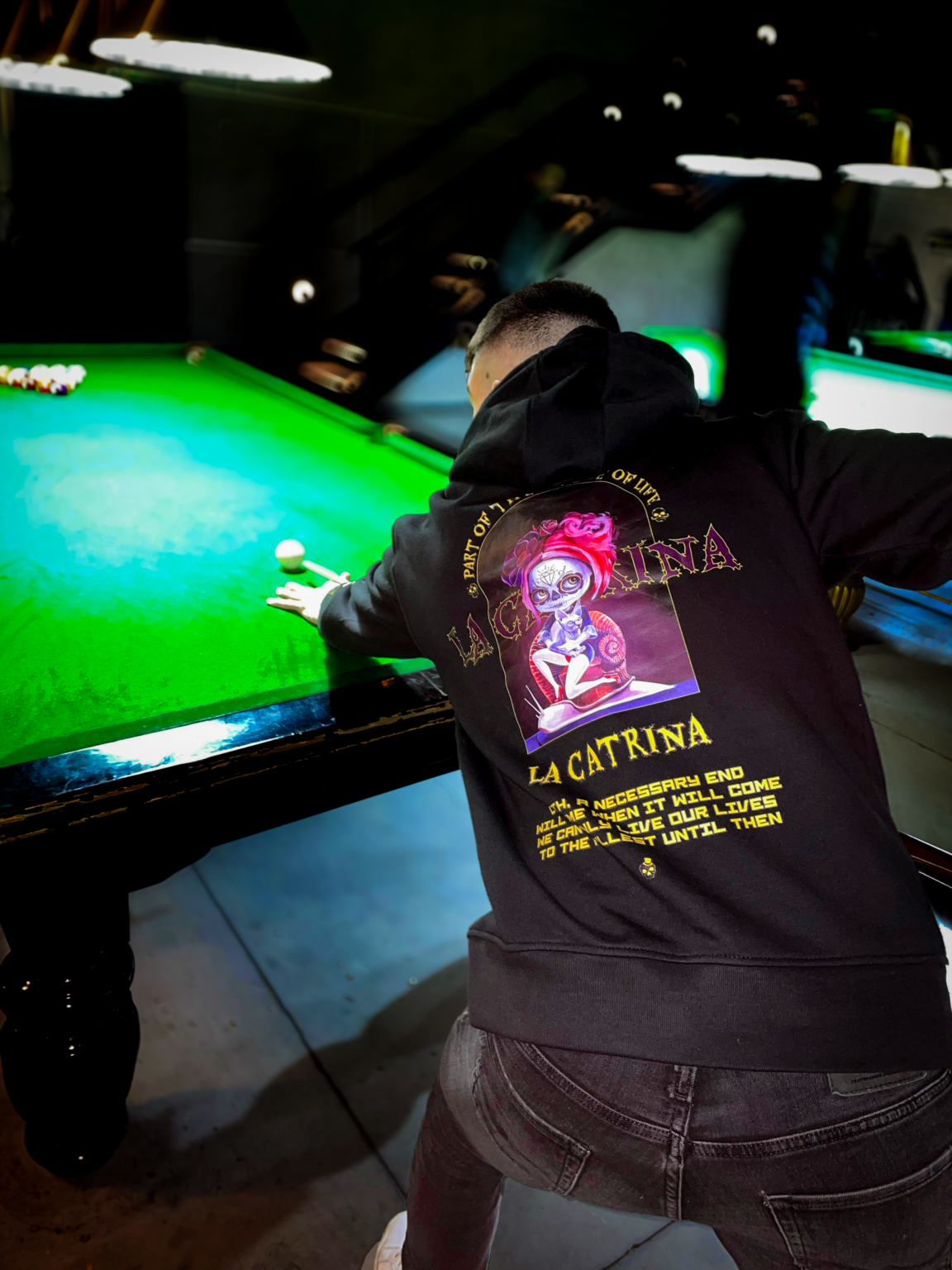
Summary of the Creative Process
Working on this design was a fascinating journey of trial and error for all of us. For a whole week, we brainstormed, experimented with countless elements and combinations, but something always felt off. Everything seemed stuck—until we realized that changing the geometry and placing the text between the two layers through Photoshop was the key. Once we figured that out, everything just started to flow. Especially when we played around with colors—once we added yellow, we knew it was the right choice. It was a challenging process, but in the end, all the elements came together perfectly, and we created something we’re truly proud of.